AI Data Table and Chart Makers Worksheets
About This Worksheet Collection
This collection of AI-supported data worksheets provides teachers with an engaging way to help students explore how information can be organized, visualized, and interpreted. Each activity begins with raw, unstructured data and guides learners through the process of transforming it into meaningful tables, charts, and graphs-often with the added support of simple ChatGPT prompts. The worksheets cover a wide spectrum of topics students enjoy, from pets and ice cream to weather, budgets, and fitness trends, making the lessons both relatable and highly accessible.
As students progress through the set, they build a strong foundation in data literacy by practicing tallying, averaging, graphing, and analyzing real-world information. They develop essential mathematical skills such as interpreting categorical data, calculating measures of center, and identifying trends over time. Just as importantly, learners gain confidence working with digital tools to support mathematical reasoning, preparing them for future academic and technological tasks.
Detailed Descriptions Of These Worksheets
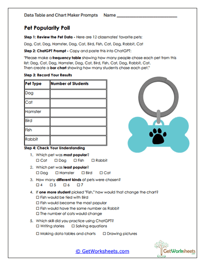
Pet Popularity Poll
Students begin with a list of classmates' pet preferences and convert the raw information into a clear frequency table. They then use an AI-generated prompt to create a bar graph that visually reflects their results. Afterward, learners answer questions that prompt them to compare categories and identify popularity trends. This worksheet helps students connect organizational skills with visual interpretation in a meaningful context.
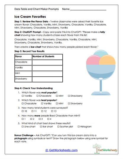
Ice Cream Favorites
Using a set of survey responses, students build a tally chart that organizes each ice cream flavor mentioned in the poll. They then generate a bar graph with the assistance of ChatGPT and use it to answer comprehension questions. The activity encourages learners to make comparisons, determine totals, and understand which representations best communicate data. It also reinforces counting skills through real-life examples.
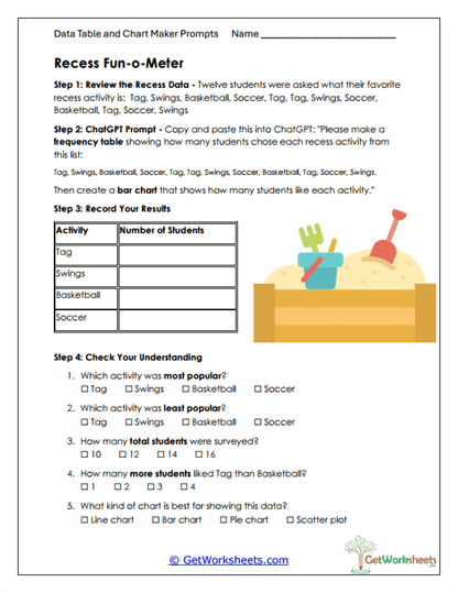
Recess Fun-o-Meter
Learners sort a list of recess activity choices and build a frequency table using a guided AI prompt. They transform those results into a bar chart that highlights the most and least preferred activities. The follow-up questions invite students to analyze their findings and interpret category differences.
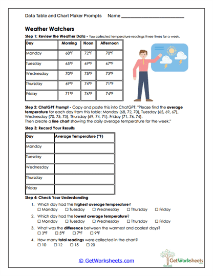
Weather Watchers
Students examine temperature readings collected throughout a week and calculate the average temperature for each day. Using an AI-assisted prompt, they create a bar chart that displays the daily averages. The worksheet encourages learners to study patterns and compare temperature changes from day to day. It supports the development of numerical reasoning alongside visual interpretation.
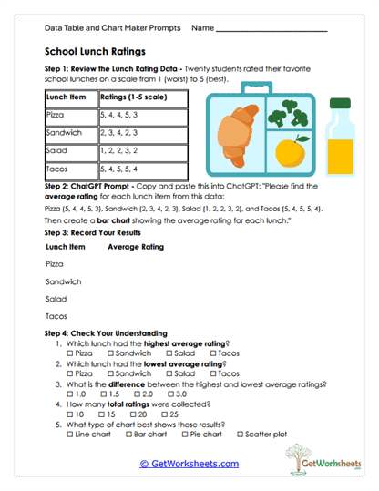
School Lunch Ratings
Using rating data for several lunch options, students compute the average score for each item. They then generate a bar graph that highlights the differences in student preferences. Follow-up questions ask students to compare the ratings and consider what the averages reveal about overall satisfaction. This activity helps learners see how numerical feedback can be summarized and analyzed.
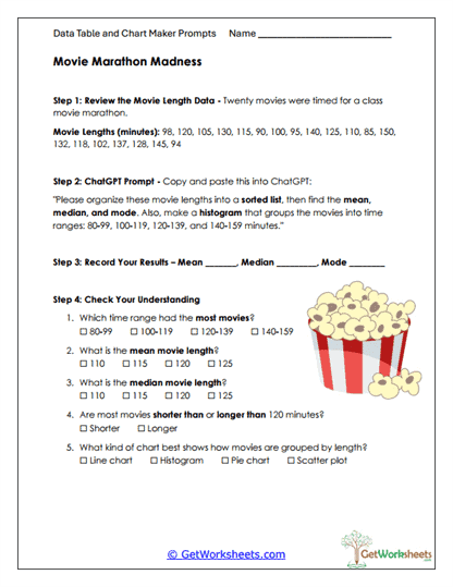
Movie Marathon Madness
Students work with a dataset of movie lengths and sort the values to calculate the mean, median, and mode. A ChatGPT prompt guides them through grouping the data into ranges and creating a histogram. Learners then answer questions about the distribution and the measures of center. This activity offers a clear introduction to analyzing larger numerical datasets.
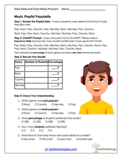
Music Playlist Popularity
After reviewing survey results about favorite music genres, students generate a frequency table and calculate genre percentages with AI support. They create a bar chart to display the proportional results and then answer questions comparing category popularity. This worksheet strengthens reasoning with percentages and encourages students to think critically about how data represents group preferences. It also reinforces how different charts convey information.
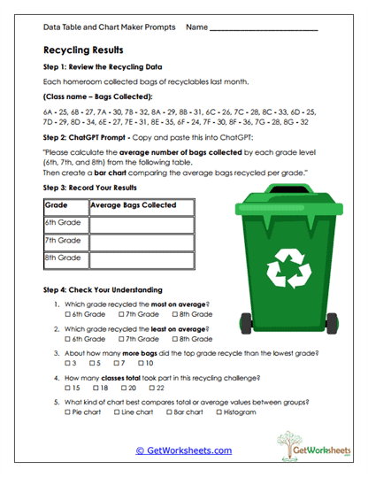
Recycling Results
Using data about the number of bags recycled by different grade levels, students compute average totals for each group. They translate the results into a bar graph that highlights differences in participation. The worksheet ends with reflective questions that help students compare the grades and interpret their findings. It blends environmental awareness with essential math skills.
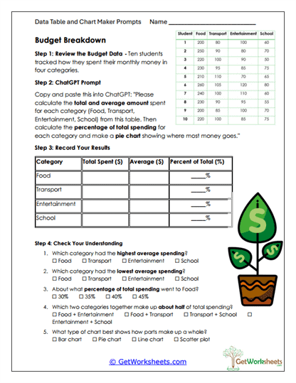
Budget Breakdown
Students explore spending habits across several categories by calculating totals, averages, and percentages. They then use those values to design a pie chart that demonstrates how each spending area contributes to the whole. The follow-up questions encourage deeper analysis and comparisons between categories. This activity offers meaningful practice with financial literacy concepts.
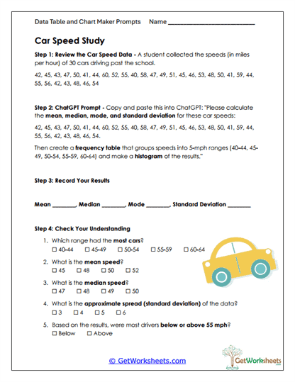
Car Speed Study
Learners analyze a set of car speed measurements collected near a school and compute the mean, median, mode, and standard deviation. Using an AI-created frequency table and histogram, they visualize how speeds are distributed across ranges. Students interpret the results to consider real-world behavior and trends. It provides a solid introduction to both central tendency and variability.
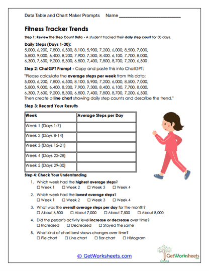
Fitness Tracker Trends
Students review 30 days of step-count data and divide it into weekly segments. They calculate the average number of steps for each week and display the results in a line graph generated with a ChatGPT prompt. The questions help learners identify rising and falling trends and draw broader conclusions about activity patterns. This worksheet builds strong skills in time-based data interpretation.
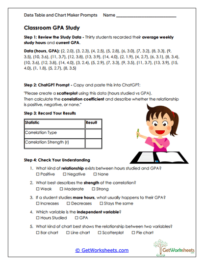
Classroom GPA Study
Working with paired data on study hours and GPA scores, students create a scatterplot through an AI-supported prompt. They compute the correlation coefficient and determine the strength and direction of the relationship. The worksheet includes questions that help clarify how variables interact and what the graph suggests about student habits. It offers a clear, accessible introduction to bivariate data analysis.
Bookmark Us Now!
New, high-quality worksheets are added every week! Do not miss out!